Let the Subject Shine
What do you want the viewer to see?
When it comes to creating composite images, one of the most important things to keep in mind is what you want your viewer to see. This is especially true where there are a lot of elements in the frame that can compete for the viewer's attention.
THE JOURNEY
This image is from my Children Series ~ the young girl is the hero and the support acts are the background, wall and gate.
The story is about a young girl changing from a child into young womanhood, the wings and bird represent the flight of her journey. The gate is about her stepping through that gateway. I choose the background first as the support act, I had to soften the tones a bit so as not to dominate the story in the foreground.
Hero vs Support Acts
So, what is the hero or support act in your composite image? The hero is the main element that you want the viewer to focus on, while the support act is any additional elements that help to enhance the hero or provide context for the scene.
I often mention this when giving feedback on images, it is something I learnt early on in my landscape days. I used the principle when taking a photograph and in my processing. It still applies for my creative images now. My style is minimalist and uncluttered, I usually choose one hero, sometimes two, but then will look for the support acts to add to give interest or tell a story.
Make a decision
When deciding on your hero element, think about what drew you to create a composite image, was it the background first or the main element etc . Once you've identified your hero element, you can begin to position your other elements around it in a way that draws the viewer's eye towards it. Sometimes I choose my background first, either one of my landscapes or digital textures then I choose the elements OR I choose an element first as I want that to be the focal point and the background or texture is the support act.
Lighting
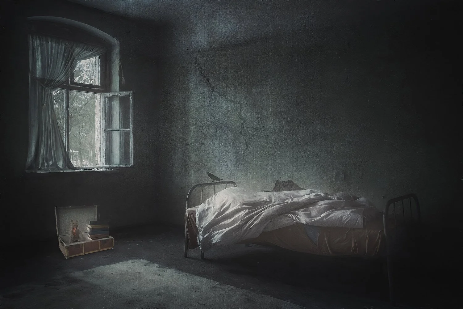
ESCAPE
This image was inspired by world events, where children had to flee their home quickly due to war. It made me think if you had just 5 mins what would a child pack in their suitcase. The background was chosen first, to support the story, the background photo had the elements I was looking for. The bed and other elements were the support acts, the suitcase with possessions is the hero, even though its not big in perspective. The bed and window are all part of the story of escaping, but I darkened those areas and added light to the rug and suitcase the draw the viewer in then wander around the image. I added the crack on the wall (with a Photoshop Brush) to represent the world they knew was breaking. I also used negative space as a support to focus on the hero.
Lighting is also a crucial factor to consider when creating your composite image. Think about the direction of the light and how it falls on your hero element. Is it backlit, side-lit, or front-lit? Different lighting conditions can create very different moods in your image, so choose the lighting that best suits the story you want to tell. I usually add the lighting more towards the end of my workflow that way the lighting enhances not dominates.
The Support acts
Finally, consider the elements that you select for your composite image. Are they helping to enhance the hero, or are they competing for attention? Remember that less is often more when it comes to creating a composite image and sometimes removing elements from the frame can actually strengthen the composition.
Think purposely
I learned these principles early on in my landscape photography journey, and I still use them today when creating composite images. By thinking about what I want my viewer to see, and carefully selecting and positioning my elements, I'm able to create images that are both visually compelling and tell a story.
COMFY CHAIR
Created purely for FUN! I chose the background purposely so I could add the chair. The background was a phone shot (would you believe a shop front) the chair was also a phone shot, photographed purposely to cut out and use somewhere.
All I added was the dog, chess pieces and clouds (why did add clouds just for fun) It all started with the chair and I had to find the right background. The hero is the chair and colour, the red curtains frame the chair from above, and draws the eye down.
Tips
Here are several tips to keep in mind when processing your composite images:
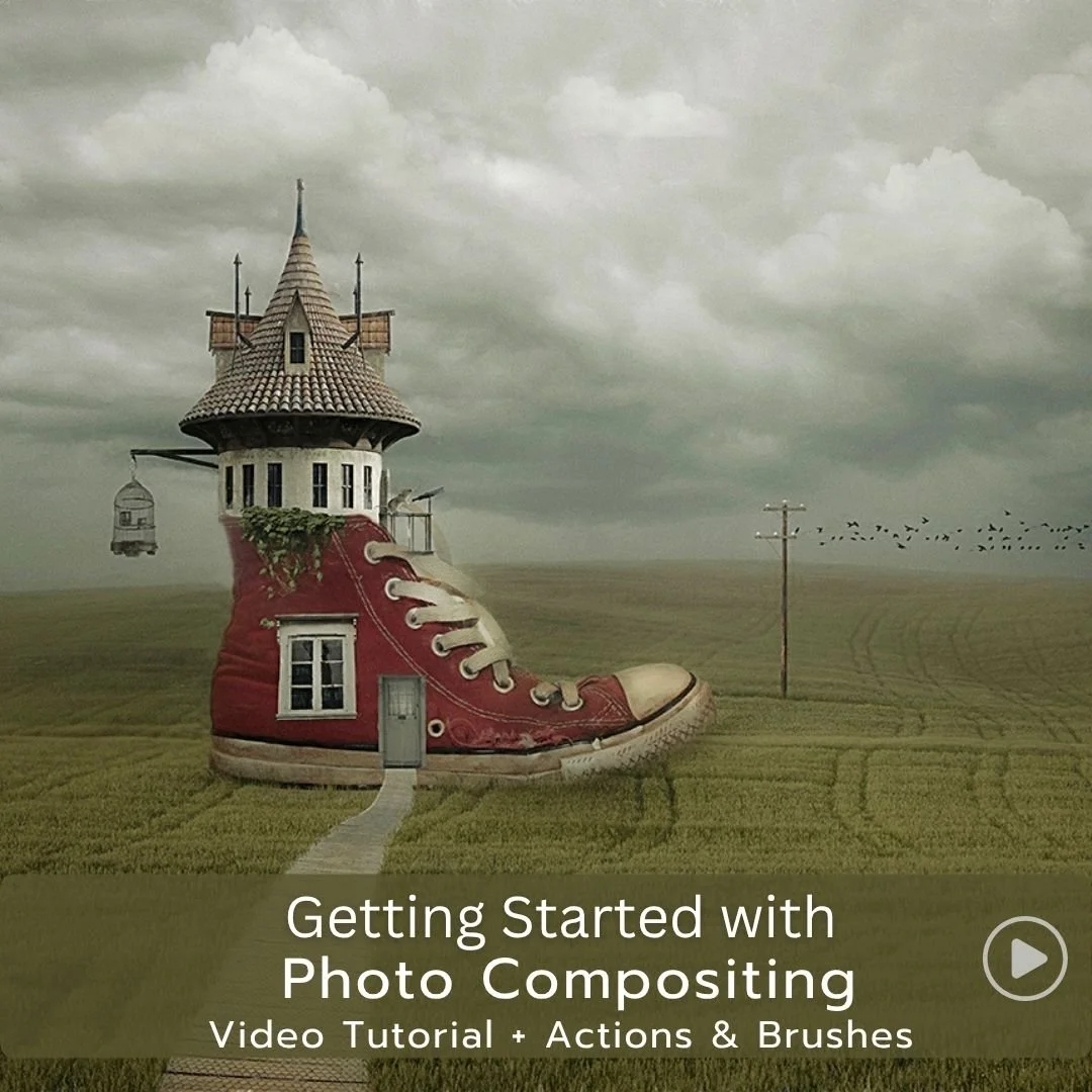
A foundational composite tutorial that guides you through essential tools, practical techniques, and simple workflows. Build confidence, speed up your process, and develop the core skills every digital artist needs.
Identify your hero element: As mentioned earlier, it's important to identify the main element that you want your viewer to focus on.
Use leading lines: Leading lines are a great way to draw the viewer's eye towards your hero element. Look for natural lines in the scene, such as a winding river or a road, and use them to lead the viewer towards your hero element.
Consider the lighting: Lighting is a crucial element in any photograph or composite image. Think about the direction of the light and how it falls on your hero element. Backlighting, sidelighting, and front lighting can all create very different moods in your image, so choose the lighting that best suits the story you want to tell. I add light to my images in many ways using brushes, dodge, levels and so on.
Use foreground interest: Adding foreground interest can help to anchor your image and provide context for the scene. Look for interesting elements in the foreground and use them to add depth and interest to your image.
Keep it simple: Don't try to cram too many elements into your image, as this can create a cluttered and confusing composition. Instead, focus on your hero element and use supporting elements to enhance it.
Take your time: Finally, take your time when creating your composite image. Don't rush the process,
as this can lead to mistakes and a less than optimal result. Take the time to carefully select and
position your elements, and use trial and error to find the best composition for your image.
More reading
Skills for Creating Composite Imagery
What is the Five Act Structure - How do screen writers use it?


